Personal Cards
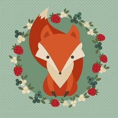
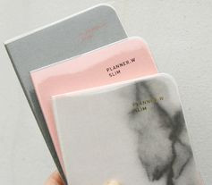
So many colors!!!! I love colors, the more the better! Ok, not really, but I do like this one :). #stationery
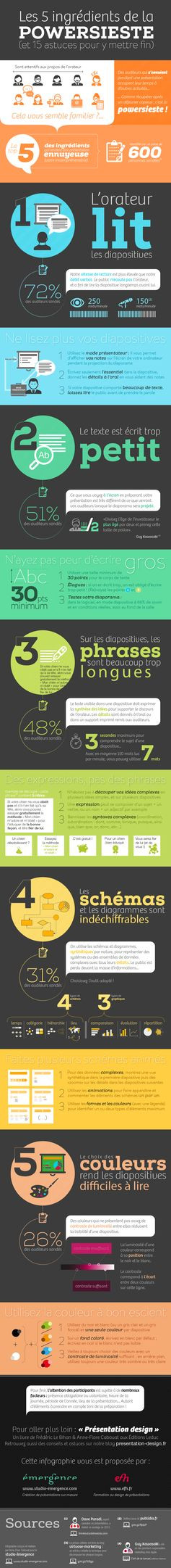
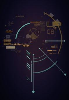
Avez-vous déjà somnolé au cours d'une présentation powerpoint ? Voici les 5 ingrédients d’une powersieste et 15 astuces pour y mettre fin sur le blog presentation-design #infographie #infographic


Designer graphique à Châteaugiron – Bienvenue chez Approche Design, graphiste créatif et passionné à Châteaugiron
How to Work At Home As A Graphic Designer. Great tips and resource list full of different websites to learn about Graphic Design
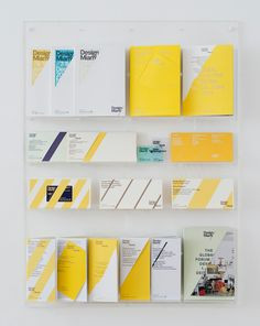
MadeThought: Ten Years Yesterday — An Exhibition of Curiosity Cabinets Presenting our Thoughts, Work and Craft at Woodbridge & Rees
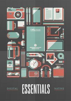
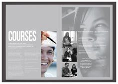
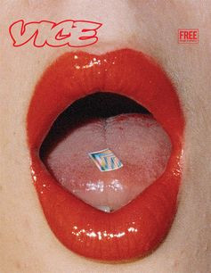
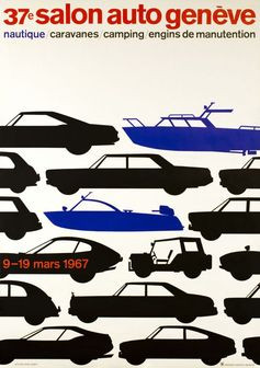
Poster design, portrait layout that uses negative space to frame the imagery as a whole and also break the space between each illustration. Uses a limited colour palette which I like, as it keeps the entire layout cohesive so nothing over powers the.