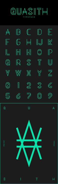
Item Details

sonia delauney (red, white and blue and a bit of black: why does this remind me of the old covers they used on the tubes upholstery)

Posted 7 years ago


sonia delauney (red, white and blue and a bit of b...

Found on core77.com
More from
core77.com


You may also like
colmata poster design

DOMO-A Inspiration blog

Color Psychology in logo design Bakehouse curated Facebook tips for Yorkshire Marketers

Berger & Fohr

Øyenvitne by anna kövecses, via Behance

Final weather icon.

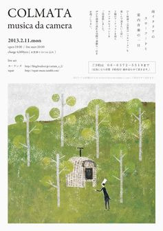
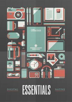
Poster design, portrait layout that uses negative space to frame the imagery as a whole and also break the space between each illustration. Uses a limited colour palette which I like, as it keeps the entire layout cohesive so nothing over powers the.

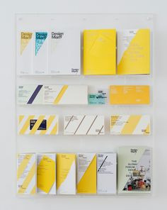
MadeThought: Ten Years Yesterday — An Exhibition of Curiosity Cabinets Presenting our Thoughts, Work and Craft at Woodbridge & Rees

Instagram post by CINEMATIC • Oct 13, 2015 at 8:02am UTC

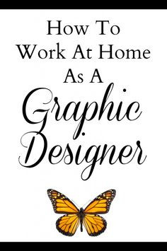
How to Work At Home As A Graphic Designer. Great tips and resource list full of different websites to learn about Graphic Design

Retro Corporate Logo Goodness_00002

bangkok_day_light.jpg by Tintins

PIKNIK / restaurant branding

Vintage Graphics No.1

MARBLE TABLE SKETCHES WIP - 2014 by Marc TRAN, via Behance

30 Fresh Examples of Mobile Apps with Circular Vibe - 2

Alex Castro Animal Portraits

Vintage Throw Pillow by susannphlike