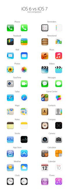
Item Details

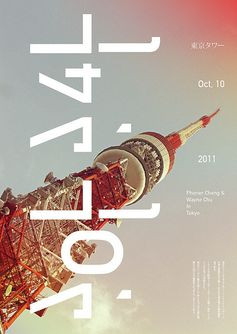
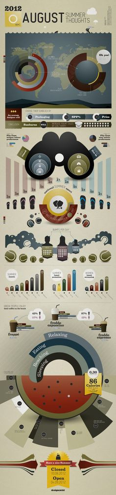
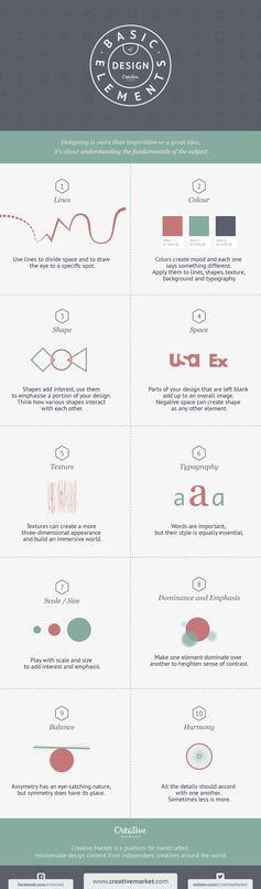
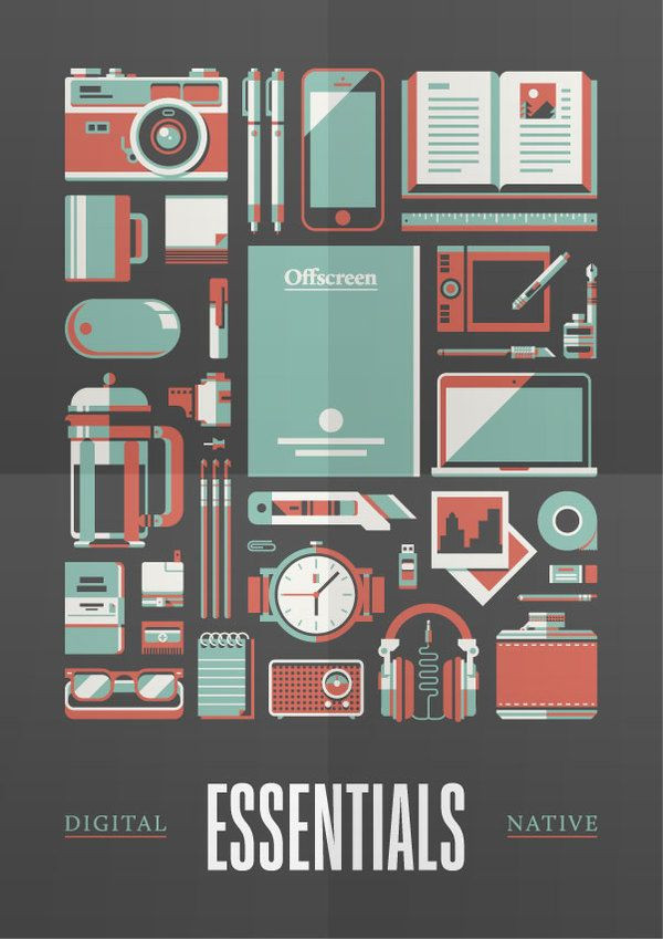
Poster design, portrait layout that uses negative space to frame the imagery as a whole and also break the space between each illustration. Uses a limited colour palette which I like, as it keeps the entire layout cohesive so nothing over powers the.

Posted 4 years ago


Poster design, portrait layout that uses negative...

Found on feedproxy.google.com
More from
feedproxy.google.com


You may also like
- Colección CAMISETAS - Pimkie España

季節の移ろいを身近に感じさせる花屋『HANASÉKKI – 24 FLOWER DROPS -』 | 箱庭 haconiwa|女子クリエーターのためのライフスタイル作りマガジン

iOS 6 vs. iOS 7: An Icon Comparison [Infographic]

東京タワー

Marks & Spencer potato crisps PD great british summer! Food packaging design

Book Design for Ryan Kittlemen’s The Great Peace

Impossible Symmetry by Estudio Minga

TheArtHunters

25 Brilliant Product Packaging Examples

Boytjie

SUMMER INFOGRAPHIC

Savon Stories

Moshik Nadav Fashion Typography and Fonts

This Graphic Teaches You the Basic Elements of Good Design

Adobe Illustrator 65 Awesome Tutorials To Help You Master Adobe Illustrator | Design Resources

naoto fukasawa: CONTAINER without thought

72 Posters Of Ridiculous Design Feedback From Clients

The images are all really sharp and clear, they're put together almost like a collage of african animals and plants. The red flowers have a drip effect and they stand out and bring life to the poster.